


 Usa luz y sombra para darle vida al texto
 Administrador


 Usa luz y sombra para darle vida al texto - 10/03/2010
Fuentes de luz
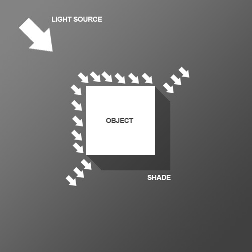
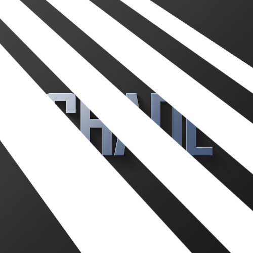
So before we start the tutorial, here is a little diagram about how light might hit an object.
Por lo tanto, antes de comenzar el tutorial, en este diagrama es un poco de luz acerca de cómo podría golpear un objeto. Here we have a square object in the middle with light coming from the top left.
Aquí tenemos un objeto cuadrado en el centro con la luz procedente de la parte superior izquierda. You can see that where the light hits the object, a shadow is cast on the other side.
Usted puede ver que cuando la luz incide en el objeto, se lanza una sombra en el otro lado. Note that the shadow is not a Photoshop drop shadow, which makes the object look like it's hovering above the canvas.
Tenga en cuenta que la sombra no es una gota de sombra de Photoshop, lo que hace que el objeto es mirada como flotando por encima de la tela. Here we want the object to look like it's a three dimensional thing stuck on the canvas, extruding if you like.
Aquí queremos que el objeto para que parezca que es una cosa tridimensional pegado sobre el lienzo, extrusión, si lo desea. Now tell me what other Photoshop tutorial site gives you diagrams?
Ahora dime lo que otros Photoshop tutorial te da los diagramas de sitio? It's like being back in school!
Es como estar de regreso en la escuela!
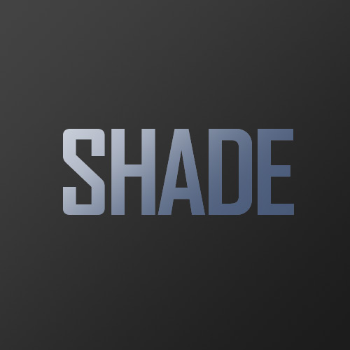
Step 1
Paso 1
We begin the tutorial by drawing a subtle Linear Gradient from dark grey to darker grey.
Empezamos por el tutorial de dibujo lineal de un sutil degradado de gris oscuro a gris oscuro. Note that because we want our light to come from the top left, that's where the lighter part of the document is.
Tenga en cuenta que porque queremos que nuestra luz que viene de la parte superior izquierda, que es donde la parte más ligera del documento.

Step 2
Paso 2
Now we place some text.
Ahora ponemos un poco de texto. I've used a very cool font called Agency FB, which has a condensed, hard-edge feel to it.
He usado una fuente muy fresco llamado Agencia FB, que tiene una condensada, el borde duro sentir a él. You should make the text a grey-ish blue color - #c2c8d4 to be precise.
Usted debe hacer el texto un color gris-ish color azul - # c2c8d4 para ser precisos.

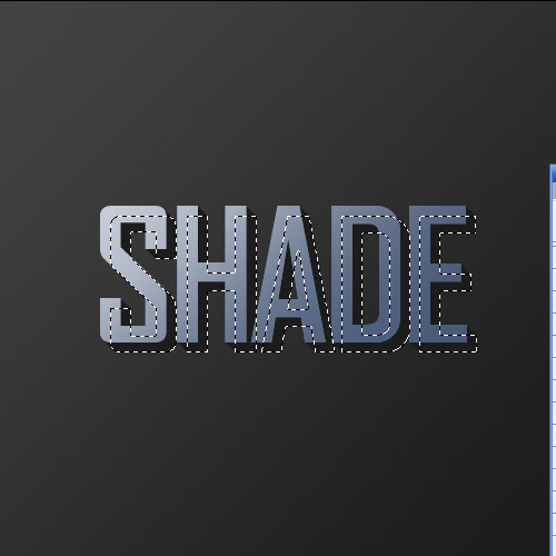
Step 3
Paso 3
Next Ctrl-click the text layer and create a new layer above it.
Ctrl + clic en Siguiente de la capa de texto y crear una nueva capa por encima de ella. In the new layer, with that selection still held, draw a linear gradient of #495a79 to transparent from bottom right to left.
En la nueva capa, con el que la selección todavía, dibujar un gradiente lineal de # 495a79 transparente desde la parte inferior de derecha a izquierda. So in other words you are darkening the bottom right as shown.
Por lo tanto, en otras palabras, usted es el oscurecimiento de la parte inferior derecha como se muestra.
Step 4
Paso 4
Set your foreground color to Black (you can do this by pressing the letter 'D' on your keyboard which restores the defaults).
Establezca su color a Negro (se puede hacer esto tiene que pulsar la letra "D" en su teclado, que restaura los valores por defecto).
Now Ctrl-click the text layer again and create a new layer beneath the text layer.
Ahora Ctrl + clic en la capa de texto de nuevo y crear una nueva capa debajo de la capa de texto. Now press the down arrow on your keyboard once and the right arrow on your keyboard once.
Ahora presione la flecha hacia abajo en el teclado de una vez la flecha hacia la derecha en su teclado una sola vez. Then press Alt+Backspace to fill it with black.
A continuación, pulse Alt + Retroceso para rellenar con color negro. Then press down and right again one time and fill with black.
A continuación, presione hacia abajo y de nuevo a la derecha una vez y se llenan de color negro. Each time you will be moving 1px right and 1px down.
Cada vez que se desplazan 1px derecho y 1px abajo. You should repeat this process about 30 times (which is why it's important to use Alt+Backspace instead of the Fill tool).
Debe repetir este proceso unas 30 veces (por lo que es importante utilizar Alt + Retroceso en lugar de la herramienta de relleno).
Note also that to move the selection but not the fills when you press your arrow keys, you have to have one of the Marquee tools on.
Tenga en cuenta también que para mover la selección pero no la llena cuando pulse las teclas de flecha de su, usted tiene que tener uno de los Marqueses de herramientas. If you switch to the Move Tool (V) when you press down and right you will actually move the black fill as well as the selection and will just be filling the same pixels over and over.
Si cambia a la herramienta Mover (V), cuando se presiona hacia abajo y derecha se mueven realmente llenar el negro, así como la selección y ser llenado de píxeles de la misma una y otra vez.
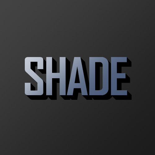
Step 5
Paso 5
Here's what you should now have.
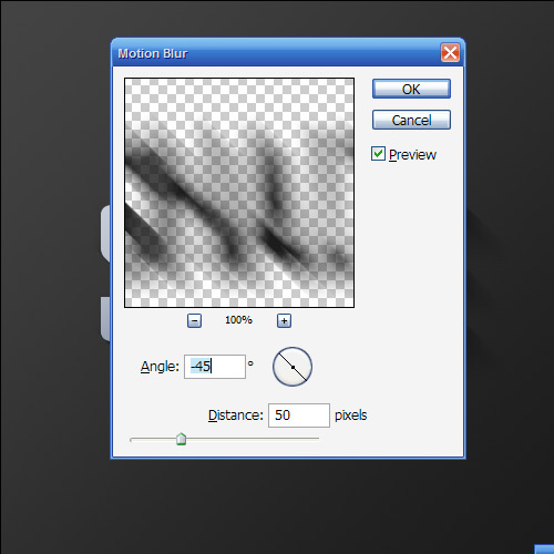
Esto es lo que debe tener ahora. Now deselect and make sure you are on the shadow layer, then go to Filter > Blur > Motion Blur and use values of -45 degrees and a distance of 30px.
Ahora deseleccionar y asegúrese de que están en la capa de sombra, y luego ir a Filtro> Blur> Motion Blur y el uso de valores de -45 grados y una distancia de 30px.
Step 6
Paso 6
Set your shadow layer to Multiply and about 40% Opacity and then hold down Shift and press the down arrow and then the right arrow.
Establezca su sombra a la capa Multiplicar y opacidad alrededor del 40% y, a continuación, mantenga pulsada Mayús y pulse la flecha hacia abajo y luego la flecha hacia la derecha. This will move your object right and down 10px each (Shift tells Photoshop to go 10px at a time instead of 1).
Este objeto se moverá de su derecha y abajo de cada 10px (Mayúsculas dice 10px Photoshop para ir a la vez en lugar de 1). Now you may have some of the blurred parts of the shadow sticking out to the top and left of the object.
Ahora usted puede tener algunas de las partes borrosas de la sombra que salen a la parte superior e izquierda del objeto. If this is the case, grab a small soft eraser and gently erase away anything which shouldn't be shaded (remember the diagram at the beginning).
Si este es el caso, agarrar una pequeña goma de borrar suave y suavemente lejos borrar todo lo que no debe ser la sombra (recuerde el esquema al principio).

Step 7
Paso 7
Next duplicate the shadow layer, hold Shift and move it down and right again.
Siguiente duplicar la capa de sombra, mantenga Mayús y moverlo hacia abajo y de nuevo a la derecha. Then run the Motion Blur filter again with a distance of 50px this time and set this layer to Multiply and 20% Opacity.
Luego ejecuta el filtro Motion Blur de nuevo con una distancia de 50 px este momento y se esta capa a Multiplicar y el 20% de opacidad. This is just to give our shadows more of a trail off.
Esto es sólo para dar a nuestros más sombras de un sendero fuera.
Step 8
Paso 8
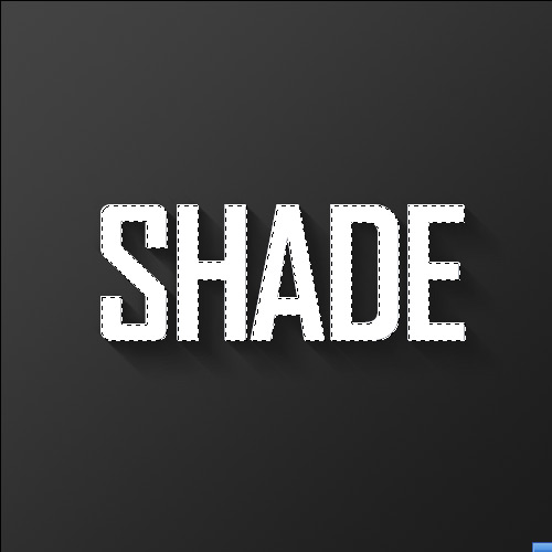
Now create a new layer above all the other layers, hold down Ctrl and click the main text layer to select its pixels and back on your new layer fill the selection with White.
Ahora crear una nueva capa por encima de todas las otras capas, mantenga pulsada la tecla Ctrl y haga clic en el texto principal de la capa para seleccionar su píxeles y volver a llenar su nueva capa con la selección de blancos. Don't let go of the selection just yet though.
No deje de ir a la selección aunque todavía. Instead press down and right one time to move 1px away and then hit Delete.
En lugar de prensa y derecho a una hora de distancia 1px mover y luego pulsa en Eliminar.
Set this thin white line layer to about 80% Opacity.
Establezca esta capa delgada línea blanca alrededor del 80% de opacidad.
Step 9
Paso 9
As you can see, the thin white line gives a sort of highlight effect where the light source is hitting the text and gives the impression that the text is more three dimensional.
Como puede ver, la delgada línea blanca da una especie de efecto de relieve que la fuente de luz está afectando el texto y da la impresión de que el texto es más tridimensional.

Step 10
Paso 10
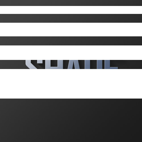
Next we want to create some streams of natural light.
Ahora vamos a crear algunos arroyos de la luz natural. Create a new layer above all the others and draw four or five white rectangles approximately similar to those shown (ie getting fatter as they go down).
Crear una nueva capa por encima de todos los demás y sacar cuatro o cinco rectángulos blancos aproximadamente similar a la que se muestra (es decir, obtener más gordo que ir hacia abajo).
Step 11
Paso 11
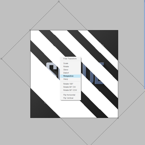
Now press Ctrl+T to transform and rotate and enlarge the rectangles as shown.
Ahora presione Ctrl + T para transformar y ampliar, rotar y los rectángulos como se muestra. Now normally you'd press Enter when you're finished, but this time don't let go just yet.
Ahora que usted normalmente pulse Intro cuando haya terminado, pero esta vez no deje ir todavía. Instead, right-click and you will get a pop up menu showing you other types of transforms you can do.
En lugar de ello, haga clic con el botón y obtendrás un menú emergente que le muestran otros tipos de transforma usted puede hacer. Choose Perspective.
Elija Perspectiva. The reason it's important to do this in one step is so that you don't lose your bounding box.
La razón es importante hacer esto en un solo paso es para que usted no perderá su caja. So take the top left two points and bring them closer together so that the light appears to be coming from one place and spreading out.
Así que la parte superior izquierda dos puntos y llevarlos más cerca juntos para que la luz parece que viene de un lugar y tendido.
Step 12
Paso 12
Here we have our four strips of "light."
Aquí tenemos a nuestros cuatro tiras de "luz". Now set the layer to Overlay and 20% Opacity and then go to Filter > Blur > Gaussian Blur and give it a blur radius of 6px.
Ahora la capa de superposición y el 20% de Opacidad y luego ir a Filtro> Blur> Gaussian Blur y le dan un radio de desenfoque 6PX.
Step 13
Paso 13
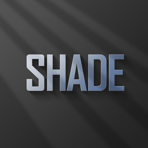
You should now have something that looks like this.
Ahora debería tener algo parecido a éste.
Step 14
Paso 14
Now since those thin strips are meant to be light, it would make sense if our highlight layer only showed up where the light was hitting right?
Ahora desde las tiras han de ser luz, tendría sentido si nuestra capa destacar sólo apareció cuando la luz estaba pegando bien? So Ctrl-click the light layer and then click on the highlight layer from earlier, then while the selection is still on, click on the Add Layer Mask button (it's the one at the bottom of the layer palette to the right of the 'f' icon).
Por lo tanto, haga clic en Ctrl-capa de la luz y, a continuación, haga clic en el relieve de la capa anterior y, a continuación, mientras que la selección todavía está en, haga clic en el botón Añadir máscara de capa (es el uno en la parte inferior de la paleta de capa a la derecha de la «f icono). This will create a Mask that only shows the highlight layer where the light overlaps it.
Esto creará una máscara que sólo se muestra la capa de relieve que la luz que se superpone.
Step 15
Paso 15
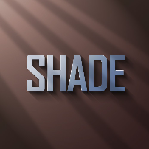
So you could stop here; it's already looking pretty good, but we'll finish this effect off by adding some warm lighting.
Así que se podría para aquí, ya está mirando muy bien, pero vamos a terminar este efecto mediante la adición de algunos frente a la iluminación cálida.
Step 16
Paso 16
So first of all create a new layer just above the background and fill it with a pinkish color - #9d506c.
Así pues, en primer lugar crear una nueva capa justo por encima del fondo y la rellenamos con un color rosado - # 9d506c.

Step 17
Paso 17
Now set the pink layer's blending mode to Colour and the opacity to 20%.
Ahora la capa de mezcla de color rosa a modo de color y la opacidad al 20%. This gives our background a nice reddish-warmth.
Esto le da un bonito fondo de nuestro rojizo-calor. Over the top of this we can now mix in some yellows.
Más de la parte superior de esta, ahora podemos mezclar en algunos amarillos. If we don't put in the reddish cast underneath, the result comes out looking overly yellow and not particularly real.
Si no ponemos en el elenco rojo por debajo, el resultado sale en busca demasiado amarillo, y no todo real.
Step 18
Paso 18
Next we create a layer just above the pink.
A continuación crear una capa por encima de la rosa. Fill it completely with white and then go to Filter > Render > Lighting Effects.
Llene completamente de blanco y luego ir a Filtro> Render> Efectos de iluminación. I don't often use Lighting Effects, but it does have one very cool preset called the Two O'clock Spotlight, which you can select by going to Style at the top and looking through the options.
No suelen usar Efectos de iluminación, pero tiene una muy cool preajuste las dos de la tarde llamado Spotlight, que puede seleccionar desde Estilo en la parte superior y mirando a través de las opciones. You can pretty much use this as default, but for our purposes it helps to extend the ellipse to make it a little longer (ie the spotlight is a little further off).
Usted puede utilizar esta casi por defecto, pero para nuestros propósitos que ayuda a extender la elipse para que sea un poco más (es decir, el punto de mira es un poco más lejos).

Step 19
Paso 19
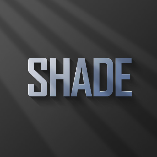
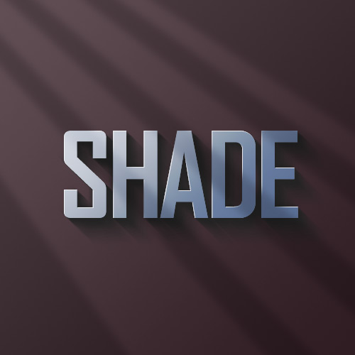
Now we set the lighting layer to Overlay and you have something like shown below.
Ahora nos hemos fijado el nivel de iluminación a la superposición y tienes algo como se muestra a continuación. Now duplicate that layer, move it above all the other and set it to 40% Opacity.
Ahora duplicar esa capa, pasar por encima de todos los demás y establecer que el 40% de opacidad. This makes sure that our warm lighting is also interacting with the text and not just the background.
Esto se asegura de que nuestra cálida iluminación es también interactuar con el texto y no sólo el fondo.
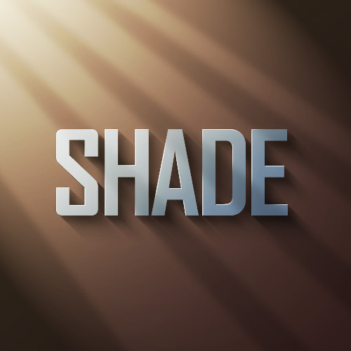
Conclusion
Conclusión
Finally, we duplicate the top lighting layer one more time and set it to 65% Opacity, then click the Add Layer Mask button on the layers palette again and draw a linear white to black gradient from top left to bottom right.
Por último, duplicar la capa superior de iluminación una vez más y establecer que un 65% de opacidad y, a continuación, haga clic en el botón Añadir máscara de capa en la paleta de capas y dibujar un nuevo lineal de color blanco a negro degradado desde la parte superior izquierda a la parte inferior derecha. This makes the extra lighting layer fade off as it goes down right.
Esto hace que la capa extra de iluminación fundido fuera como él va derecho hacia abajo.
So before we start the tutorial, here is a little diagram about how light might hit an object.
Por lo tanto, antes de comenzar el tutorial, en este diagrama es un poco de luz acerca de cómo podría golpear un objeto. Here we have a square object in the middle with light coming from the top left.
Aquí tenemos un objeto cuadrado en el centro con la luz procedente de la parte superior izquierda. You can see that where the light hits the object, a shadow is cast on the other side.
Usted puede ver que cuando la luz incide en el objeto, se lanza una sombra en el otro lado. Note that the shadow is not a Photoshop drop shadow, which makes the object look like it's hovering above the canvas.
Tenga en cuenta que la sombra no es una gota de sombra de Photoshop, lo que hace que el objeto es mirada como flotando por encima de la tela. Here we want the object to look like it's a three dimensional thing stuck on the canvas, extruding if you like.
Aquí queremos que el objeto para que parezca que es una cosa tridimensional pegado sobre el lienzo, extrusión, si lo desea. Now tell me what other Photoshop tutorial site gives you diagrams?
Ahora dime lo que otros Photoshop tutorial te da los diagramas de sitio? It's like being back in school!
Es como estar de regreso en la escuela!
Step 1
Paso 1
We begin the tutorial by drawing a subtle Linear Gradient from dark grey to darker grey.
Empezamos por el tutorial de dibujo lineal de un sutil degradado de gris oscuro a gris oscuro. Note that because we want our light to come from the top left, that's where the lighter part of the document is.
Tenga en cuenta que porque queremos que nuestra luz que viene de la parte superior izquierda, que es donde la parte más ligera del documento.
Step 2
Paso 2
Now we place some text.
Ahora ponemos un poco de texto. I've used a very cool font called Agency FB, which has a condensed, hard-edge feel to it.
He usado una fuente muy fresco llamado Agencia FB, que tiene una condensada, el borde duro sentir a él. You should make the text a grey-ish blue color - #c2c8d4 to be precise.
Usted debe hacer el texto un color gris-ish color azul - # c2c8d4 para ser precisos.
Step 3
Paso 3
Next Ctrl-click the text layer and create a new layer above it.
Ctrl + clic en Siguiente de la capa de texto y crear una nueva capa por encima de ella. In the new layer, with that selection still held, draw a linear gradient of #495a79 to transparent from bottom right to left.
En la nueva capa, con el que la selección todavía, dibujar un gradiente lineal de # 495a79 transparente desde la parte inferior de derecha a izquierda. So in other words you are darkening the bottom right as shown.
Por lo tanto, en otras palabras, usted es el oscurecimiento de la parte inferior derecha como se muestra.
Step 4
Paso 4
Set your foreground color to Black (you can do this by pressing the letter 'D' on your keyboard which restores the defaults).
Establezca su color a Negro (se puede hacer esto tiene que pulsar la letra "D" en su teclado, que restaura los valores por defecto).
Now Ctrl-click the text layer again and create a new layer beneath the text layer.
Ahora Ctrl + clic en la capa de texto de nuevo y crear una nueva capa debajo de la capa de texto. Now press the down arrow on your keyboard once and the right arrow on your keyboard once.
Ahora presione la flecha hacia abajo en el teclado de una vez la flecha hacia la derecha en su teclado una sola vez. Then press Alt+Backspace to fill it with black.
A continuación, pulse Alt + Retroceso para rellenar con color negro. Then press down and right again one time and fill with black.
A continuación, presione hacia abajo y de nuevo a la derecha una vez y se llenan de color negro. Each time you will be moving 1px right and 1px down.
Cada vez que se desplazan 1px derecho y 1px abajo. You should repeat this process about 30 times (which is why it's important to use Alt+Backspace instead of the Fill tool).
Debe repetir este proceso unas 30 veces (por lo que es importante utilizar Alt + Retroceso en lugar de la herramienta de relleno).
Note also that to move the selection but not the fills when you press your arrow keys, you have to have one of the Marquee tools on.
Tenga en cuenta también que para mover la selección pero no la llena cuando pulse las teclas de flecha de su, usted tiene que tener uno de los Marqueses de herramientas. If you switch to the Move Tool (V) when you press down and right you will actually move the black fill as well as the selection and will just be filling the same pixels over and over.
Si cambia a la herramienta Mover (V), cuando se presiona hacia abajo y derecha se mueven realmente llenar el negro, así como la selección y ser llenado de píxeles de la misma una y otra vez.
Step 5
Paso 5
Here's what you should now have.
Esto es lo que debe tener ahora. Now deselect and make sure you are on the shadow layer, then go to Filter > Blur > Motion Blur and use values of -45 degrees and a distance of 30px.
Ahora deseleccionar y asegúrese de que están en la capa de sombra, y luego ir a Filtro> Blur> Motion Blur y el uso de valores de -45 grados y una distancia de 30px.
Step 6
Paso 6
Set your shadow layer to Multiply and about 40% Opacity and then hold down Shift and press the down arrow and then the right arrow.
Establezca su sombra a la capa Multiplicar y opacidad alrededor del 40% y, a continuación, mantenga pulsada Mayús y pulse la flecha hacia abajo y luego la flecha hacia la derecha. This will move your object right and down 10px each (Shift tells Photoshop to go 10px at a time instead of 1).
Este objeto se moverá de su derecha y abajo de cada 10px (Mayúsculas dice 10px Photoshop para ir a la vez en lugar de 1). Now you may have some of the blurred parts of the shadow sticking out to the top and left of the object.
Ahora usted puede tener algunas de las partes borrosas de la sombra que salen a la parte superior e izquierda del objeto. If this is the case, grab a small soft eraser and gently erase away anything which shouldn't be shaded (remember the diagram at the beginning).
Si este es el caso, agarrar una pequeña goma de borrar suave y suavemente lejos borrar todo lo que no debe ser la sombra (recuerde el esquema al principio).
Step 7
Paso 7
Next duplicate the shadow layer, hold Shift and move it down and right again.
Siguiente duplicar la capa de sombra, mantenga Mayús y moverlo hacia abajo y de nuevo a la derecha. Then run the Motion Blur filter again with a distance of 50px this time and set this layer to Multiply and 20% Opacity.
Luego ejecuta el filtro Motion Blur de nuevo con una distancia de 50 px este momento y se esta capa a Multiplicar y el 20% de opacidad. This is just to give our shadows more of a trail off.
Esto es sólo para dar a nuestros más sombras de un sendero fuera.
Step 8
Paso 8
Now create a new layer above all the other layers, hold down Ctrl and click the main text layer to select its pixels and back on your new layer fill the selection with White.
Ahora crear una nueva capa por encima de todas las otras capas, mantenga pulsada la tecla Ctrl y haga clic en el texto principal de la capa para seleccionar su píxeles y volver a llenar su nueva capa con la selección de blancos. Don't let go of the selection just yet though.
No deje de ir a la selección aunque todavía. Instead press down and right one time to move 1px away and then hit Delete.
En lugar de prensa y derecho a una hora de distancia 1px mover y luego pulsa en Eliminar.
Set this thin white line layer to about 80% Opacity.
Establezca esta capa delgada línea blanca alrededor del 80% de opacidad.
Step 9
Paso 9
As you can see, the thin white line gives a sort of highlight effect where the light source is hitting the text and gives the impression that the text is more three dimensional.
Como puede ver, la delgada línea blanca da una especie de efecto de relieve que la fuente de luz está afectando el texto y da la impresión de que el texto es más tridimensional.
Step 10
Paso 10
Next we want to create some streams of natural light.
Ahora vamos a crear algunos arroyos de la luz natural. Create a new layer above all the others and draw four or five white rectangles approximately similar to those shown (ie getting fatter as they go down).
Crear una nueva capa por encima de todos los demás y sacar cuatro o cinco rectángulos blancos aproximadamente similar a la que se muestra (es decir, obtener más gordo que ir hacia abajo).
Step 11
Paso 11
Now press Ctrl+T to transform and rotate and enlarge the rectangles as shown.
Ahora presione Ctrl + T para transformar y ampliar, rotar y los rectángulos como se muestra. Now normally you'd press Enter when you're finished, but this time don't let go just yet.
Ahora que usted normalmente pulse Intro cuando haya terminado, pero esta vez no deje ir todavía. Instead, right-click and you will get a pop up menu showing you other types of transforms you can do.
En lugar de ello, haga clic con el botón y obtendrás un menú emergente que le muestran otros tipos de transforma usted puede hacer. Choose Perspective.
Elija Perspectiva. The reason it's important to do this in one step is so that you don't lose your bounding box.
La razón es importante hacer esto en un solo paso es para que usted no perderá su caja. So take the top left two points and bring them closer together so that the light appears to be coming from one place and spreading out.
Así que la parte superior izquierda dos puntos y llevarlos más cerca juntos para que la luz parece que viene de un lugar y tendido.
Step 12
Paso 12
Here we have our four strips of "light."
Aquí tenemos a nuestros cuatro tiras de "luz". Now set the layer to Overlay and 20% Opacity and then go to Filter > Blur > Gaussian Blur and give it a blur radius of 6px.
Ahora la capa de superposición y el 20% de Opacidad y luego ir a Filtro> Blur> Gaussian Blur y le dan un radio de desenfoque 6PX.
Step 13
Paso 13
You should now have something that looks like this.
Ahora debería tener algo parecido a éste.
Step 14
Paso 14
Now since those thin strips are meant to be light, it would make sense if our highlight layer only showed up where the light was hitting right?
Ahora desde las tiras han de ser luz, tendría sentido si nuestra capa destacar sólo apareció cuando la luz estaba pegando bien? So Ctrl-click the light layer and then click on the highlight layer from earlier, then while the selection is still on, click on the Add Layer Mask button (it's the one at the bottom of the layer palette to the right of the 'f' icon).
Por lo tanto, haga clic en Ctrl-capa de la luz y, a continuación, haga clic en el relieve de la capa anterior y, a continuación, mientras que la selección todavía está en, haga clic en el botón Añadir máscara de capa (es el uno en la parte inferior de la paleta de capa a la derecha de la «f icono). This will create a Mask that only shows the highlight layer where the light overlaps it.
Esto creará una máscara que sólo se muestra la capa de relieve que la luz que se superpone.
Step 15
Paso 15
So you could stop here; it's already looking pretty good, but we'll finish this effect off by adding some warm lighting.
Así que se podría para aquí, ya está mirando muy bien, pero vamos a terminar este efecto mediante la adición de algunos frente a la iluminación cálida.
Step 16
Paso 16
So first of all create a new layer just above the background and fill it with a pinkish color - #9d506c.
Así pues, en primer lugar crear una nueva capa justo por encima del fondo y la rellenamos con un color rosado - # 9d506c.
Step 17
Paso 17
Now set the pink layer's blending mode to Colour and the opacity to 20%.
Ahora la capa de mezcla de color rosa a modo de color y la opacidad al 20%. This gives our background a nice reddish-warmth.
Esto le da un bonito fondo de nuestro rojizo-calor. Over the top of this we can now mix in some yellows.
Más de la parte superior de esta, ahora podemos mezclar en algunos amarillos. If we don't put in the reddish cast underneath, the result comes out looking overly yellow and not particularly real.
Si no ponemos en el elenco rojo por debajo, el resultado sale en busca demasiado amarillo, y no todo real.
Step 18
Paso 18
Next we create a layer just above the pink.
A continuación crear una capa por encima de la rosa. Fill it completely with white and then go to Filter > Render > Lighting Effects.
Llene completamente de blanco y luego ir a Filtro> Render> Efectos de iluminación. I don't often use Lighting Effects, but it does have one very cool preset called the Two O'clock Spotlight, which you can select by going to Style at the top and looking through the options.
No suelen usar Efectos de iluminación, pero tiene una muy cool preajuste las dos de la tarde llamado Spotlight, que puede seleccionar desde Estilo en la parte superior y mirando a través de las opciones. You can pretty much use this as default, but for our purposes it helps to extend the ellipse to make it a little longer (ie the spotlight is a little further off).
Usted puede utilizar esta casi por defecto, pero para nuestros propósitos que ayuda a extender la elipse para que sea un poco más (es decir, el punto de mira es un poco más lejos).
Step 19
Paso 19
Now we set the lighting layer to Overlay and you have something like shown below.
Ahora nos hemos fijado el nivel de iluminación a la superposición y tienes algo como se muestra a continuación. Now duplicate that layer, move it above all the other and set it to 40% Opacity.
Ahora duplicar esa capa, pasar por encima de todos los demás y establecer que el 40% de opacidad. This makes sure that our warm lighting is also interacting with the text and not just the background.
Esto se asegura de que nuestra cálida iluminación es también interactuar con el texto y no sólo el fondo.
Conclusion
Conclusión
Finally, we duplicate the top lighting layer one more time and set it to 65% Opacity, then click the Add Layer Mask button on the layers palette again and draw a linear white to black gradient from top left to bottom right.
Por último, duplicar la capa superior de iluminación una vez más y establecer que un 65% de opacidad y, a continuación, haga clic en el botón Añadir máscara de capa en la paleta de capas y dibujar un nuevo lineal de color blanco a negro degradado desde la parte superior izquierda a la parte inferior derecha. This makes the extra lighting layer fade off as it goes down right.
Esto hace que la capa extra de iluminación fundido fuera como él va derecho hacia abajo.

Sin Comentarios.